A list of rules is not what makes a visual brand thrive.
The Brand Guide—for a lot of organizations, it’s one of the first things that makes a brand feel “legit.” Many times it’s the first real deliverable sent after a rebrand has been completed. By cataloging the visual elements that comprise your brand, it tells you what your brand should look like, and conversely, what it shouldn’t look like.
It’s beautiful. Even if you still don’t know what “PMS” means on the color page.
And it is your calling to steward the precepts inscribed within this hallowed PDF with a sober vigilance and unyielding stringency.
Why visual brands go stale
The fact of the matter is that your brand guide wasn’t written on stone tablets by the brand gods and it certainly isn’t going to be enough to sustain your brand for the long haul.
Ask anyone that’s had to apply brand guidelines regularly over any significant length of time. No matter how exhaustive a brand guide may be—no matter how many potential facets of the visual brand it covers—you‘ll eventually run out of all possible combinations of colors, fonts, logo variations, or (shudder) …stock photography.
If the expression of your visual brand begins and ends with a few logo iterations and a list of acceptable color values and fonts, you’re setting yourself up for heartache and your visual brand will grow stale almost immediately.
This is not an indictment of brand guides. They’re an absolute necessity. But we can begin to expose our own misunderstanding of their proper use when we draw the distinction between a visual brand being stale and a visual brand being recognizable. The difference is application.
For example, signage must be branded and recognizable, lest a customer gets lost. However, that kind of mechanical recognition is a liability in an Instagram feed. What people need when they’re trying to find your doors in a crowded space vs. what they need to prompt engagement while scrolling on their phone are two very different things.
So what does it look like for a long-standing brand to remain fresh without losing its identity?

The Public
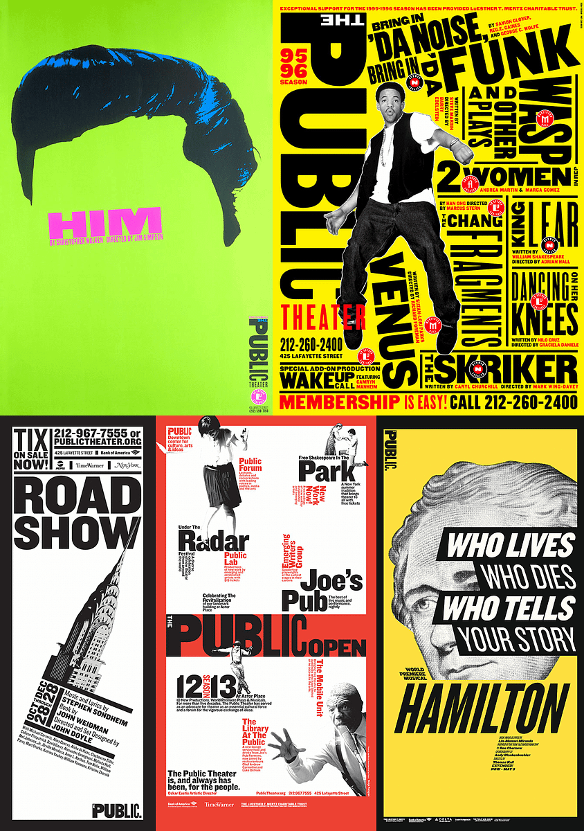
Paula Scher designed the visual identity for The Public Theater in 1994. And besides a few growing pains in the earlier years, its iconic look has not only endured but has remained a benchmark of great design, year after year.
I would challenge anyone to extrapolate absolute “brand guidelines” from these posters. Sure, there might be prevailing typography—but the layout, color, and interaction with imagery are different in each application. And that variance increases exponentially when other posters from different seasons are factored in.
But they all feel like The Public.
Why is that? And how can you keep a visual brand as fresh as they have over these many years? Well, as I see it, you have a couple of options.
Option 1: The Almighty Art Director
This option is the most obvious and easy in the short term, but it’s also the least sustainable. The idea is that you find (and keep) someone who understands the essence of the brand. They have a knack for creating stuff that just works. And every visual passes through their filter.
In smaller organizations, this could be a designer. In larger organizations, this could be an art director or even a well-meaning C-suite executive. But this model is fragile. At best, it’s a bottleneck—at worst, it lives and dies on the shoulders of that individual.
And sure, keeping Paula Scher on retainer for the lifetime of your brand is definitely one possibility—but let’s just assume that neither her schedule nor your budget could facilitate it. Which brings us to…
Option 2: Systematic Strategy
This option requires more effort to establish, but like compound interest, its value isn’t truly appreciated until later. As you progress further along in the life of the visual brand, this option pays dividends—and isn’t a long life the goal of any brand?
The big idea here is that strategy informs design, meaning that the “why” has to supersede the “what.” You must uncover the strategic goals of your brand and translate those goals into their visual application. These are often referred to as “design principles.”
And yes, you will still need a brand guide. There are baseline visual cues for your brand that you need your audience to recognize. But when you have a clear definition of the “why” behind those visuals, you’ll be able to use those design principles to apply the philosophy of the visual brand to any medium in a dynamic, strategy-first way. This allows you to escape the world of stale, rules-based design and opens the door to more creative possibilities for your brand and more meaningful engagement from your audience.
But your design principles are only as good as your brand strategy.
At Historic, we specialize in creating strategies for your brand that are people-centered and meet the needs of your audience. Let us help you take the pressure off your brand guide. Book a call with us today!


